Visualization
Overview
COLA provides rich visualization tools to help you understand and communicate counterfactual refinement results. These visualizations show:
Which features were changed
How features were changed (increase/decrease)
How many actions are required
Diversity of counterfactual options
Available Visualizations
COLA offers five main visualization types:
Highlighted DataFrames - Side-by-side comparison with color highlighting
Direction Heatmap - Show which features increase/decrease
Binary Heatmap - Show which features changed
Stacked Bar Chart - Compare action counts before/after refinement
Diversity Analysis - Explore alternative minimal feature combinations
Quick Start
from xai_cola import COLA
from xai_cola.ce_sparsifier.data import COLAData
from xai_cola.ce_sparsifier.models import Model

# Setup and refine
sparsifier = COLA(data=data, ml_model=ml_model)
sparsifier.set_policy(matcher="ot", attributor="pshap")
refined = sparsifier.refine_counterfactuals(limited_actions=5)

# Visualize!
sparsifier.heatmap_direction(save_path='./results')
sparsifier.stacked_bar_chart(save_path='./results')
1. Highlighted DataFrames
Show factual and counterfactual data side-by-side with color-coded changes.
Highlight changes comparison
Compare factual, original CF, and refined ACE:
# Get highlighted DataFrames
factual_style, ce_style, ace_style = sparsifier.highlight_changes_comparison()

# Display in Jupyter
display(factual_style, ce_style, ace_style) # display the highlighted dataframes

# Save to HTML
ce_style.to_html('original_cf.html')
ace_style.to_html('refined_ace.html')
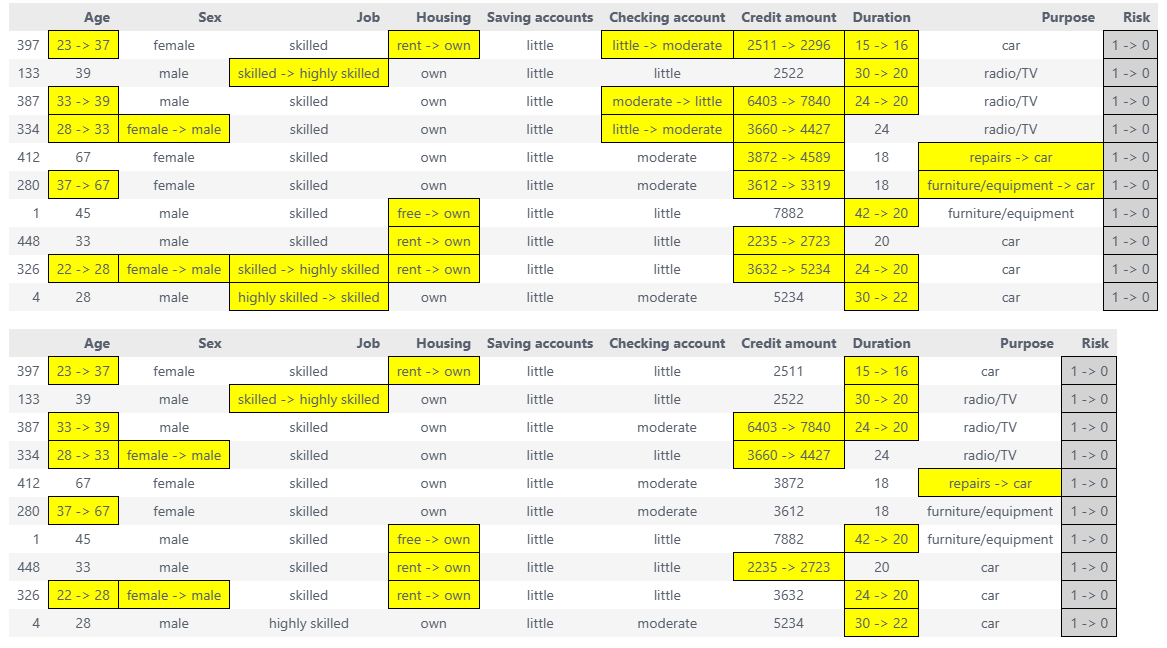
Highlight changes final
Compare factual, original CF, and refined ACE:
# Get highlighted DataFrames
factual_style, ce_style, ace_style = sparsifier.highlight_changes_final()

# Display in Jupyter
display(factual_style)  # Original data
display(ce_style)       # Original counterfactual (more changes)
display(ace_style)      # Refined counterfactual (fewer changes)

# Save to HTML
ce_style.to_html('original_cf.html')
ace_style.to_html('refined_ace.html')
When to use:
Presenting to stakeholders
Detailed instance-by-instance analysis
Generating reports
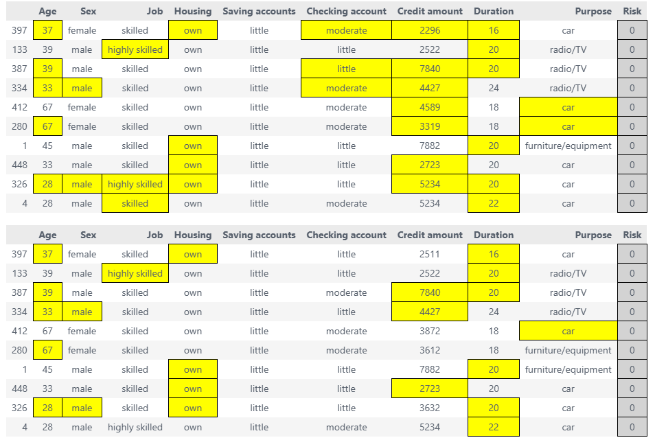
2. Direction Heatmap
Visualize the direction of feature changes (increase vs decrease) across instances.
Basic Usage
# Generate direction heatmap
fig = sparsifier.heatmap_direction(
    save_path='./results',
    save_mode='combined',      # 'combined', 'separate'
    show_axis_labels=True,     # Show feature and instance names
    figsize=(12, 8)
)
Color coding:
⬜ Gray - Value of factual data
⬛ Black - Label column flip (class transition)
🟦 Blue (#56B4E9) - Numerical feature increased
🟢 Cyan (#7FCDCD) - Numerical feature decreased
🟧 Peru (#CD853F) - Categorical feature changed
Save Modes
Combined mode - CE and ACE side by side:
fig = sparsifier.heatmap_direction(
    save_path='./results',
    save_mode='combined'  # Default
)
Separate mode - Two separate heatmaps:
fig = sparsifier.heatmap_direction(
    save_path='./results',
    save_mode='separate'
)
# Creates: heatmap_direction_counterfactual.png
#          heatmap_direction_counterfactual_with_limited_actions.png
When to use:
Understanding feature change patterns
Identifying which features typically increase/decrease
Comparing CE vs ACE visually
3. Binary Heatmap
Show which features changed (binary: changed or not changed).
Basic Usage
# Generate binary heatmap
fig = sparsifier.heatmap_binary(
    save_path='./results',
    save_mode='combined'
)
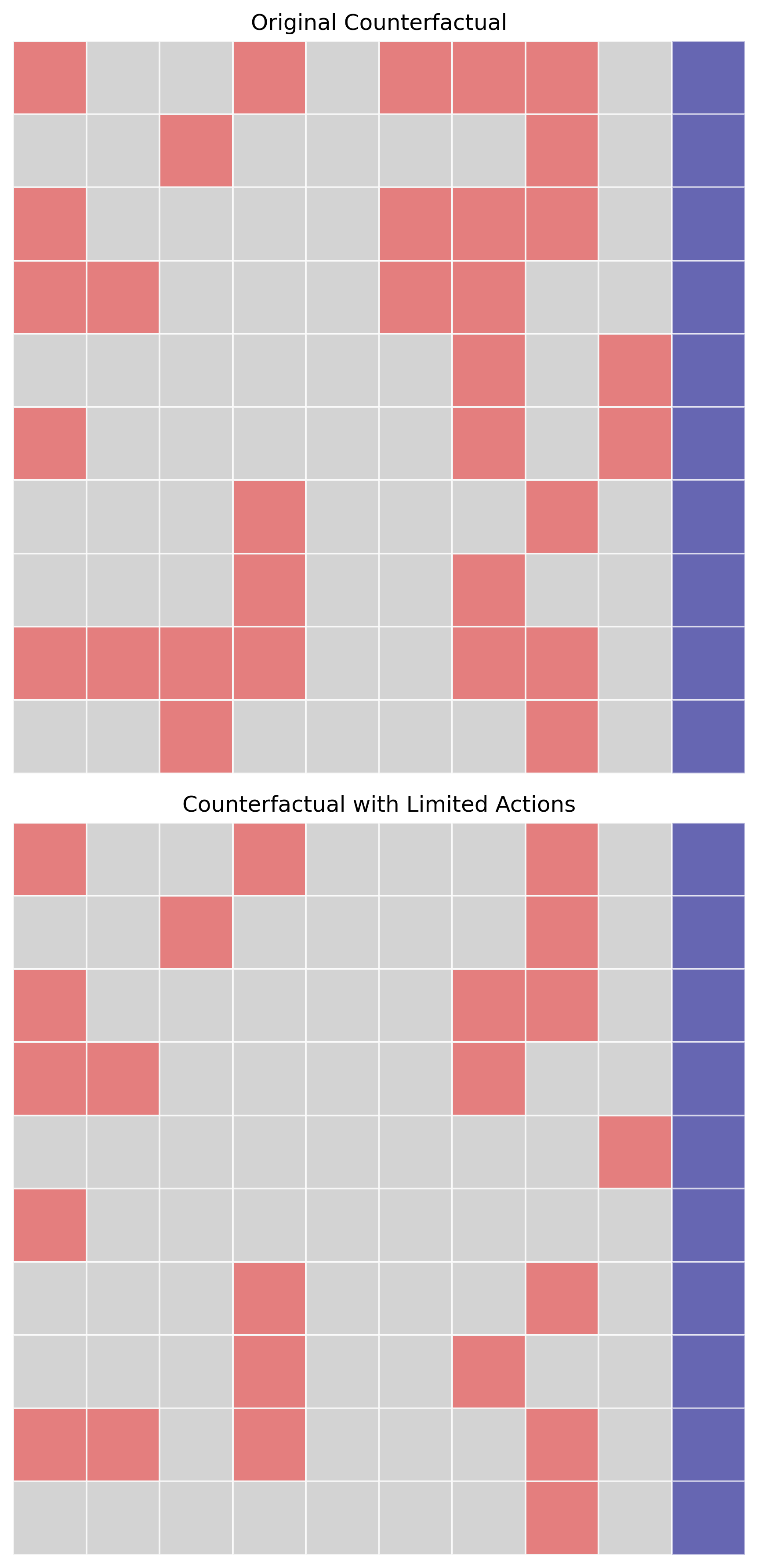
Color coding:
⬜ Gray - Value of factual data
🟣 Purple - Label column flip (class transition)
🔴 Red - Feature changed
When to use:
Focusing on which features changed, not how
Counting total feature changes
Simple visual comparison
4. Stacked Bar Chart
Compare the number of feature changes before and after sparsification.
Basic Usage
# Generate stacked bar chart
fig = sparsifier.stacked_bar_chart(
    save_path='./results',
    figsize=(14, 6)
)
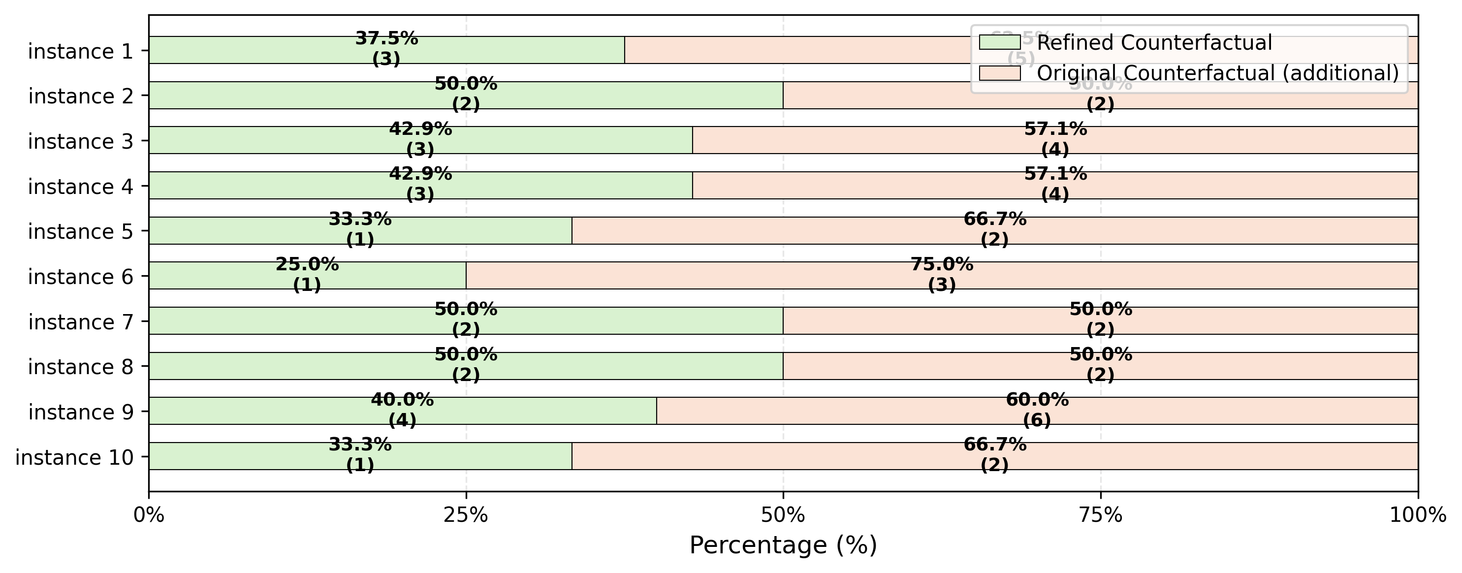
What it shows:
Y-axis (rows): Each factual instance - one row per instance
X-axis (horizontal bars): Percentage or count of feature changes needed to flip the label column relative to factual data
Colors:
Green bar: Number of features modified in refined (sparsified) counterfactuals
Orange bar: Number of features modified in original counterfactuals
Each row displays two horizontal bars (green + orange) representing the comparison between refined ACE and original CF
Key insight: The chart clearly demonstrates that for almost every instance, the green bars (refined counterfactuals) are significantly shorter than orange bars (original counterfactuals), showing that COLA’s sparsification requires fewer feature changes to achieve the same label-flipping outcome
When to use:
Demonstrating COLA’s sparsification effectiveness
Showing the reduction in required feature changes after refinement
Comparing original counterfactuals vs. refined counterfactuals
Presentations and papers
5. Diversity Analysis
Explore alternative minimal feature combinations for achieving the same outcome.
Core Logic:
After COLA refines counterfactuals and significantly reduces the number of feature changes, diversity analysis uses an exhaustive enumeration approach to:
Find all possible minimal feature combinations that can flip the label column
Ensure true minimality: if changing one feature alone can flip the label, no additional features are explored in combination with it
Present multiple alternative paths to achieve the same outcome with minimal changes
This provides users with a diverse set of actionable options, each requiring the smallest possible number of feature modifications.
Basic Usage
factual_df, diversity_styles = sparsifier.diversity()
for i, style in enumerate(diversity_styles):
    print(f"Instance {i+1} diversity:")
    display(style)
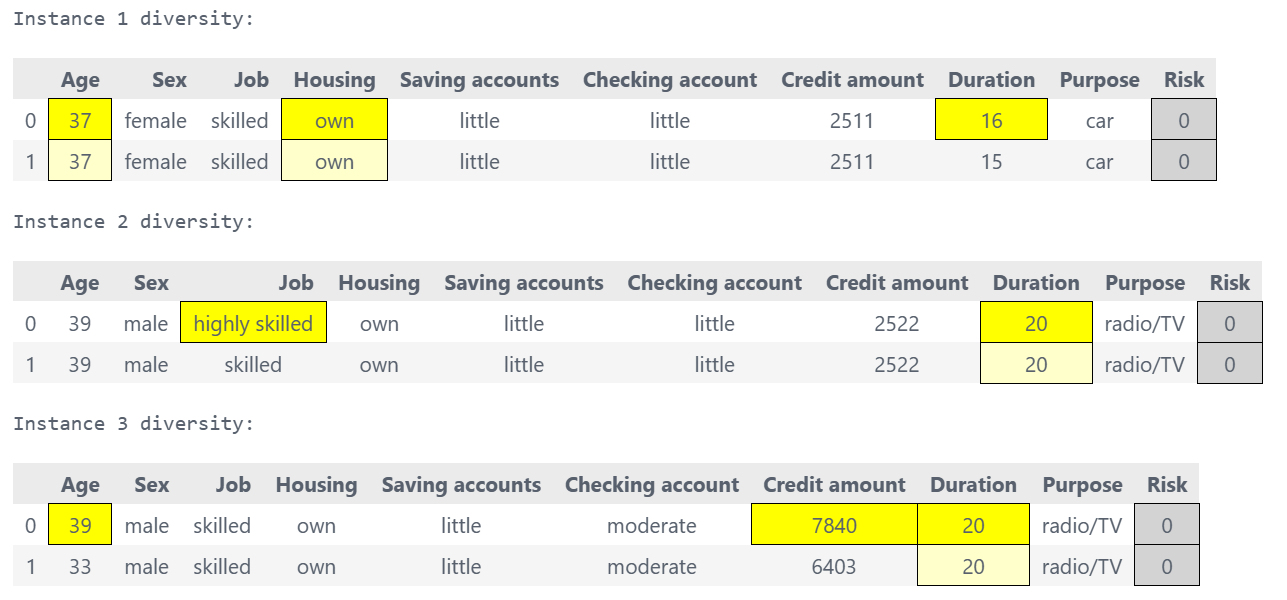
What it shows:
For each instance, shows multiple alternative minimal feature combinations that achieve the desired label flip:
Each alternative represents a different set of features to modify
All alternatives use the minimum number of features necessary
No redundant feature combinations (e.g., if changing feature A alone works, combinations like A+B are excluded)
Provides actionable choices for users to select the most feasible path
Common Issues
Issue 1: Figures Too Small
Problem: Text is unreadable in saved figures.
Solution: Increase figsize and DPI:
# ❌ Too small
fig = sparsifier.heatmap_direction(figsize=(6, 4))

# ✅ Better
fig = sparsifier.heatmap_direction(figsize=(16, 10), dpi=300)
Issue 2: Colors Not Showing
Problem: Heatmap appears all white.
Cause: No features changed.
Solution: Check if refinement actually changed anything:
factual_df, ce_df, ace_df = sparsifier.get_all_results(limited_actions=5)

# Count changes
changes = (factual_df != ace_df).sum().sum()
print(f"Total feature changes: {changes}")

if changes == 0:
    print("No changes - increase limited_actions")
Issue 3: HTML Not Displaying
Problem: HTML files don’t show styling.
Solution: Use display() in Jupyter or open HTML directly in browser:
# In Jupyter
from IPython.display import display
display(styled_df)

# Or save and open in browser
styled_df.to_html('results.html')
# Then open results.html in Chrome/Firefox
Issue 4: Memory Error with Large Datasets
Problem: OutOfMemoryError when generating visualizations.
Solution: Visualize a subset:
# Get results
factual_df, ce_df, ace_df = sparsifier.get_all_results(limited_actions=5)

# Visualize first 50 instances
from xai_cola.ce_sparsifier.visualization import generate_direction_heatmap

fig = generate_direction_heatmap(
    factual_df=factual_df.head(50),
    cf_df=ce_df.head(50),
    ace_df=ace_df.head(50),
    label_column='Risk',
    save_path='./results'
)
Best Practices
✅ DO:
Generate multiple visualization types for comprehensive understanding
# Show different aspects
sparsifier.heatmap_direction(save_path='./results')  # How
sparsifier.stacked_bar_chart(save_path='./results')  # How many
sparsifier.highlight_changes_final()                 # Details
Use appropriate figure sizes for your medium
# Paper: smaller, high DPI
figsize=(10, 6), dpi=300

# Presentation: larger, medium DPI
figsize=(16, 10), dpi=150

# Web: medium, low DPI
figsize=(12, 8), dpi=96
Save in multiple formats for flexibility
fig = sparsifier.heatmap_direction(save_path='./results')
fig.savefig('./results/heatmap.png', dpi=300, bbox_inches='tight')
fig.savefig('./results/heatmap.pdf', bbox_inches='tight')  # Vector
fig.savefig('./results/heatmap.svg', bbox_inches='tight')  # Vector
Create a results directory before saving
import os
os.makedirs('./results', exist_ok=True)
❌ DON’T:
Don’t forget to refine before visualizing
# ❌ Error - no refinement yet
sparsifier = COLA(data=data, ml_model=ml_model)
sparsifier.heatmap_direction()

# ✅ Correct
sparsifier.set_policy(matcher="ot", attributor="pshap")
sparsifier.refine_counterfactuals(limited_actions=5)
sparsifier.heatmap_direction()
Don’t use show_axis_labels=True with many features - too cluttered
Don’t generate huge figures - stick to reasonable sizes
API Reference
For complete parameter details, see:
generate_direction_heatmap()generate_binary_heatmap()generate_stacked_bar_chart()highlight_changes_final()generate_diversity_for_all_instances()
Next Steps
Review complete examples in Tutorial 1: Basic COLA Workflow
See Matching Policies for refinement strategies
Check Counterfactual Explainers for CF generation methods